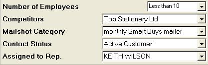
Drop-down Menus - where the user must make a selection from pre-defined
options, drop-down menus are used to present the list of options available.
The following image shows examples of drop-down menus:
To display the items on a drop-down menu, click the .
The list of options in
that menu will 'drop down' as shown:
You can click an option with the mouse to select it, or use the down cursor
arrow to highlight it then press Enter or Return. Typing the first letter of an
option in the menu will also highlight it. This can also be done without
dropping down the menu.
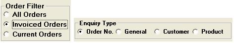
Radio Buttons - these are used where there is a list of two or more options
that are mutually exclusive,and the user must select exactly one choice.
Clicking a non-selected radio button will deselect whatever other button was
previously selected in the list. Here are two examples of radio buttons:
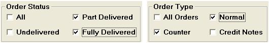
Check Boxes - these are used where there are lists of options and the user
mayselect any numberof choices, including zero, one, or several. Each
check box is independent of all other check boxes in the list, so selecting one
box does not usually deselect the others. Clicking the box once with the
mouse cursor selects it, entering a tick in the box to indicate that it has been
selected. Clicking it again will deselect it, removing the tick. Here are two
examples:
Search Icons - these are available where you are asked to select an account
code or product code. The search icon usually looks like this , but product
search may also use the following icon . You can use the search
programs these icons link you to, to help find and select the required code you
wish to enter.
 .
The list of options in
that menu will 'drop down' as shown:
.
The list of options in
that menu will 'drop down' as shown: 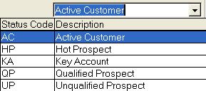
 , but product
search may also use the following icon
, but product
search may also use the following icon  . You can use the search
programs these icons link you to, to help find and select the required code you
wish to enter.
. You can use the search
programs these icons link you to, to help find and select the required code you
wish to enter.